---
title: Where catalogs appear in the UI
doc_id: 2015e77e-af40-48b8-bf7b-b6a541ecf42c
description: >-
Explains how catalogs automatically appear in nullplatform UI across entity
dashboards, forms, and filters.
keywords:
- UI visibility
- catalog display
- entity dashboards
- forms
- nullplatform
---
import Tabs from '@theme/Tabs';
import TabItem from '@theme/TabItem';
# Where catalogs appear in the UI
This page explains where and how catalogs appear in the platform, and how you can control their visibility and layout
using fields like `visibleOn`, `tag`, and `uiSchema`.
Once a catalog instance is attached to an entity, nullplatform automatically surfaces it in the UI without any custom
development.
The platform uses the associated catalog specification to determine:
- **Where** the catalog appears (tabs, side panels, etc.)
- **How** it's displayed (tags, read-only sections, editable forms)
- **When** it's visible (on create, update, list, read—based on your schema)
This makes it easy to build structured, discoverable, and reusable experiences across teams.
## Entity dashboards
### Namespace dashboard
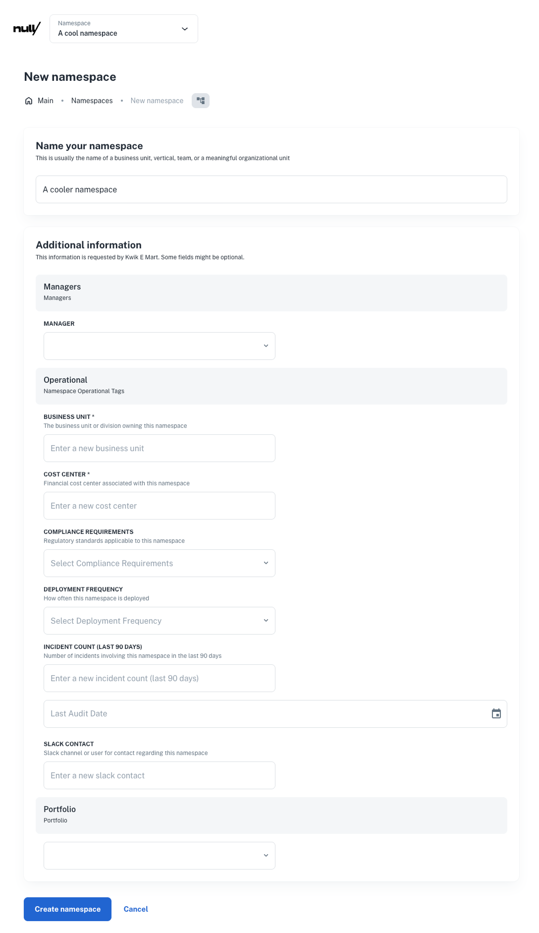
- **Form section during creation**
If one or more specs exist for `namespace`, a dynamic form will be shown when creating one.
- **Catalog blocks on show all modal**
Each catalog group (e.g., `operational`, `portfolio`, `managers`) appears as a section.
Users can click **Show all** to open the full form for editing.
- `links` renders a dedicated “Resources” block at the top of the page.
*Example:*
 ### Application dashboard
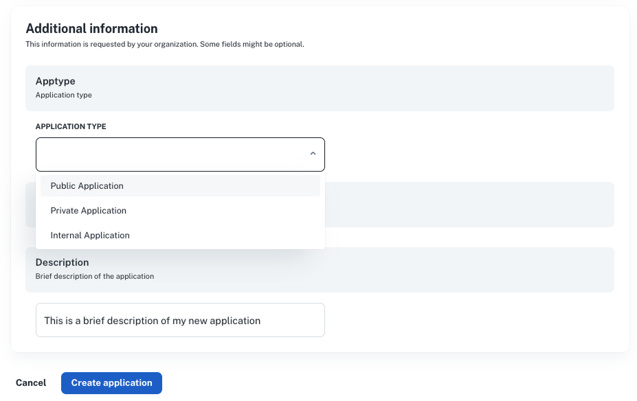
- **Form section during creation**
Specs like `apptype`, `description`, or `platform_info` generate form fields when a new application is created.
- **Sidebar catalog**
Catalog instances show up as compact summary blocks in the right sidebar.
Users can click **Show all** to open the full form for editing.
- **Tags and filters**
If fields are tagged in the schema, they appear:
- In application filters
- As chips in table views
- As sorting and grouping options
- **Built-in blocks**
- `links` → renders a **Useful links** component for external tools or dashboards
*Example:*
### Application dashboard
- **Form section during creation**
Specs like `apptype`, `description`, or `platform_info` generate form fields when a new application is created.
- **Sidebar catalog**
Catalog instances show up as compact summary blocks in the right sidebar.
Users can click **Show all** to open the full form for editing.
- **Tags and filters**
If fields are tagged in the schema, they appear:
- In application filters
- As chips in table views
- As sorting and grouping options
- **Built-in blocks**
- `links` → renders a **Useful links** component for external tools or dashboards
*Example:*
 ### Build detail page
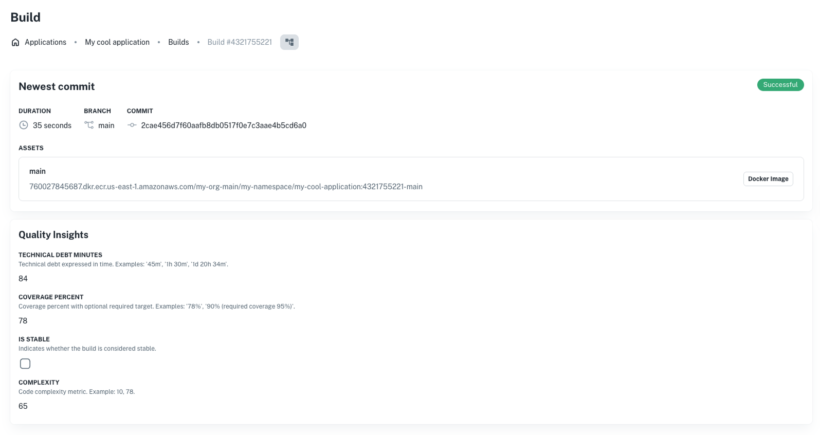
- **Quality Insights section**
When a `quality_insights` spec is attached, for example, fields like `coverage_percent`, `complexity`, or
`vulnerabilities` are rendered in a dedicated block.
- **Visual filters and tags**
If a catalog field is marked with `"tag"`, it becomes available for:
- Dashboard filters
- Custom reporting
- Smart grouping in list views
- `links` renders a dedicated “Resources” block at the top of the page.
*Example:*
### Build detail page
- **Quality Insights section**
When a `quality_insights` spec is attached, for example, fields like `coverage_percent`, `complexity`, or
`vulnerabilities` are rendered in a dedicated block.
- **Visual filters and tags**
If a catalog field is marked with `"tag"`, it becomes available for:
- Dashboard filters
- Custom reporting
- Smart grouping in list views
- `links` renders a dedicated “Resources” block at the top of the page.
*Example:*
 ### User profiles
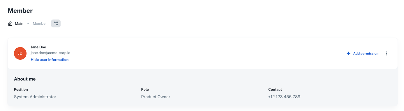
- If the `about` catalog spec is attached to a user, it renders as a profile summary (e.g., role, contact info,
job title) on their member page.
- This catalog is read-only in most cases and used for directory browsing and user context.
*Example:*
### User profiles
- If the `about` catalog spec is attached to a user, it renders as a profile summary (e.g., role, contact info,
job title) on their member page.
- This catalog is read-only in most cases and used for directory browsing and user context.
*Example:*
 ## Controlling field visibility with `visibleOn`
Each field in a catalog spec can use a `visibleOn` array to control where it shows up in the UI and platform views.
```json
"coverage_percent": {
"type": "integer",
"description": "Coverage % for this build",
"visibleOn": ["create", "update", "read", "list"]
}
```
Accepted values:
- `create`: shows up in the entity creation form
- `read`: shows up in the detail view
- `update`: appears when editing catalog
- `list`: appears in tables and overviews
> 💡 If `visibleOn` is not set, the field defaults to being visible in all views except for `list` views.
:::info
You’ll define `visibleOn` in the schema of a catalog spec. We dive into specs in the next page.
:::
### Optional UI layout overrides: `uiSchema`
In most cases, nullplatform will automatically generate a form layout from your JSON Schema.
If you need to customize the layout, such as rendering a field as a radio group, hiding a field, or grouping fields in
sections—you can define an optional `uiSchema`.
Example:
```json
"uiSchema": {
"type": "VerticalLayout",
"elements": [
{
"type": "Control",
"scope": "#/properties/application_type",
"options": {
"format": "radio"
}
}
]
}
```
Use `uiSchema` to:
- Override default layout (e.g., horizontal vs. vertical)
- Render enums as radio buttons or dropdowns
- Control spacing and grouping
> 💡 The platform uses JSON forms behind the scenes for rendering and layout. See our
> [Designing the UI docs](/docs/json-ui-schema/overview) for more info.
## Tag-driven behavior
Any catalog field marked with `"tag": true` (or a custom string like `"tag": "portfolio"`) is automatically exposed to:
- Filtering and grouping in dashboards
- Sorting in tables
- External integrations that rely on tags (e.g., for FinOps, cost reporting, inventory mapping)
Example:
```json
"portfolio": {
"type": "string",
"enum": ["Online", "Payments", "RBI"],
"tag": "portfolio"
}
```
See [Tags in catalogs](/docs/catalog/tags) for detailed use cases, API queries, and integration patterns.
## Next steps
- [Define catalog specifications](/docs/catalog/define-catalog-specs)
## Controlling field visibility with `visibleOn`
Each field in a catalog spec can use a `visibleOn` array to control where it shows up in the UI and platform views.
```json
"coverage_percent": {
"type": "integer",
"description": "Coverage % for this build",
"visibleOn": ["create", "update", "read", "list"]
}
```
Accepted values:
- `create`: shows up in the entity creation form
- `read`: shows up in the detail view
- `update`: appears when editing catalog
- `list`: appears in tables and overviews
> 💡 If `visibleOn` is not set, the field defaults to being visible in all views except for `list` views.
:::info
You’ll define `visibleOn` in the schema of a catalog spec. We dive into specs in the next page.
:::
### Optional UI layout overrides: `uiSchema`
In most cases, nullplatform will automatically generate a form layout from your JSON Schema.
If you need to customize the layout, such as rendering a field as a radio group, hiding a field, or grouping fields in
sections—you can define an optional `uiSchema`.
Example:
```json
"uiSchema": {
"type": "VerticalLayout",
"elements": [
{
"type": "Control",
"scope": "#/properties/application_type",
"options": {
"format": "radio"
}
}
]
}
```
Use `uiSchema` to:
- Override default layout (e.g., horizontal vs. vertical)
- Render enums as radio buttons or dropdowns
- Control spacing and grouping
> 💡 The platform uses JSON forms behind the scenes for rendering and layout. See our
> [Designing the UI docs](/docs/json-ui-schema/overview) for more info.
## Tag-driven behavior
Any catalog field marked with `"tag": true` (or a custom string like `"tag": "portfolio"`) is automatically exposed to:
- Filtering and grouping in dashboards
- Sorting in tables
- External integrations that rely on tags (e.g., for FinOps, cost reporting, inventory mapping)
Example:
```json
"portfolio": {
"type": "string",
"enum": ["Online", "Payments", "RBI"],
"tag": "portfolio"
}
```
See [Tags in catalogs](/docs/catalog/tags) for detailed use cases, API queries, and integration patterns.
## Next steps
- [Define catalog specifications](/docs/catalog/define-catalog-specs)