Preview results live
Use the built-in playground to edit and preview your specs (including optional uiSchema) before rolling them out.
It gives you instant visual feedback for quick sanity checks.
ℹ️ Note: The playground is available for service and scope specs only. Catalog specs don’t have a playground yet.
Test it out using the playground
To open the playground, navigate to Platform settings > Scopes (or Services) > Specifications.
- Click + New specification or open an existing one.
- Add or update your JSON Schema and UI schema.
- Preview the form on the right to confirm layout, labels, and markdown render.
- Save when you’re happy. (We recommend testing in a non-prod scope or a draft spec first.)
Minimal example
The playground lets you quickly test how JSON Schema and UI Schema.
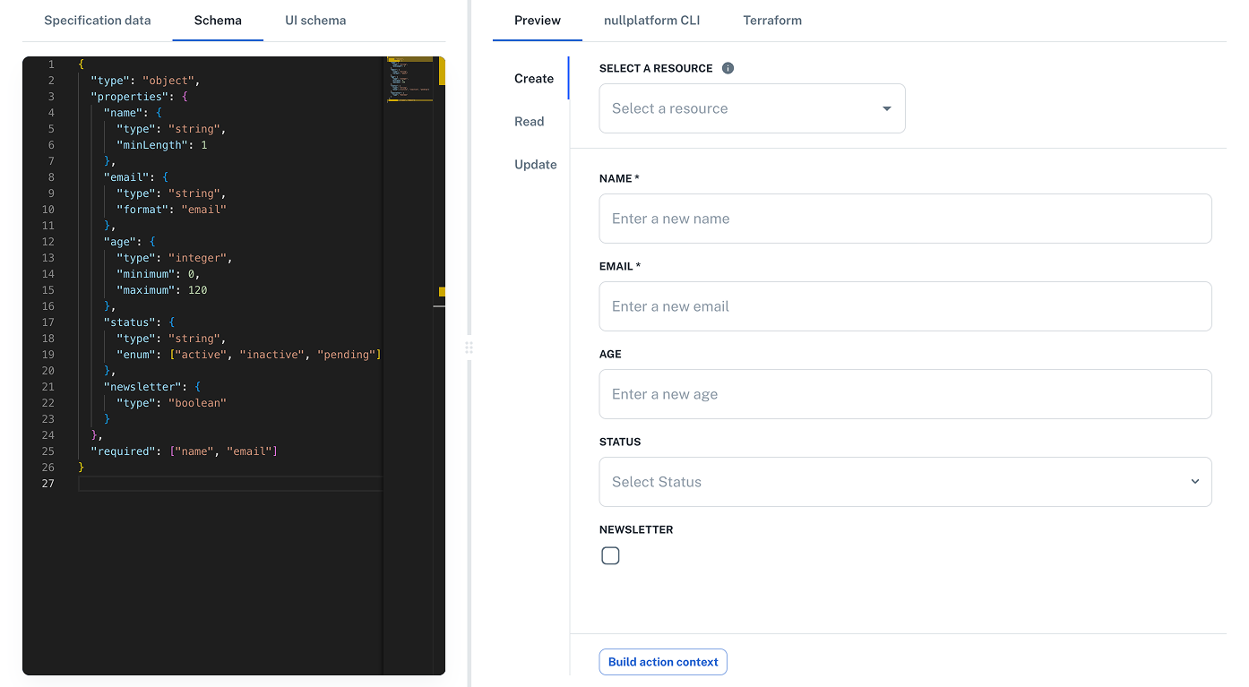
Step 1: Add a JSON Schema
In the JSON Schema tab
{
  "type": "object",
  "properties": {
    "name": {
      "type": "string",
      "minLength": 1
    },
    "email": {
      "type": "string",
      "format": "email"
    },
    "age": {
      "type": "integer",
      "minimum": 0,
      "maximum": 120
    },
    "status": {
      "type": "string",
      "enum": ["active", "inactive", "pending"]
    },
    "newsletter": {
      "type": "boolean"
    }
  },
  "required": ["name", "email"]
}
You should now see the default form rendered on the right side of the screen based only on JSON Schema.
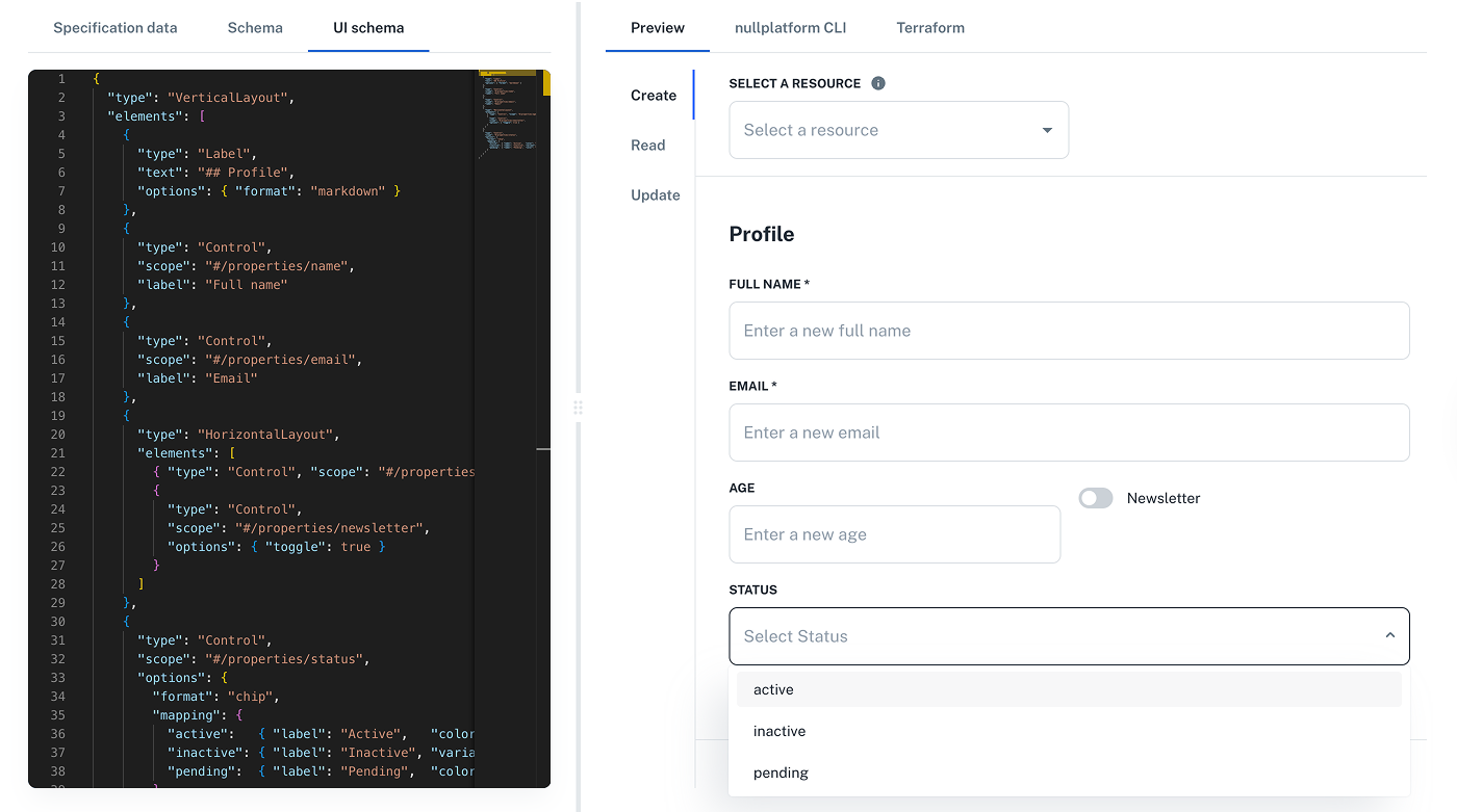
Step 2: Add a UI Schema
Switch to the UI Schema tab and paste this layout:
{
  "type": "VerticalLayout",
  "elements": [
    {
      "type": "Label",
      "text": "## Profile",
      "options": { "format": "markdown" }
    },
    {
      "type": "Control",
      "scope": "#/properties/name",
      "label": "Full name"
    },
    {
      "type": "Control",
      "scope": "#/properties/email",
      "label": "Email"
    },
    {
      "type": "HorizontalLayout",
      "elements": [
        { "type": "Control", "scope": "#/properties/age" },
        {
          "type": "Control",
          "scope": "#/properties/newsletter",
          "options": { "toggle": true }
        }
      ]
    },
    {
      "type": "Control",
      "scope": "#/properties/status",
      "options": {
        "format": "chip",
        "mapping": {
          "active":   { "label": "Active",   "color": "success", "icon": "ic:outline-check" },
          "inactive": { "label": "Inactive", "variant": "outlined" },
          "pending":  { "label": "Pending",  "color": "warning" }
        }
      }
    }
  ]
}
Now the preview updates instantly with a custom layout, including headers, markdown labels, toggle switches, and chip formatting.
Ready-to-use UI schema patterns
Here are ready-to-use examples you can copy and adapt for your specifications.
Including markdown
Use Label elements with options.format: "markdown" to add rich help and callouts.
Click to expand the JSON example
{
// ...service specification
"attributes": {
"schema": {
"uiSchema": {
"type": "VerticalLayout",
"elements": [
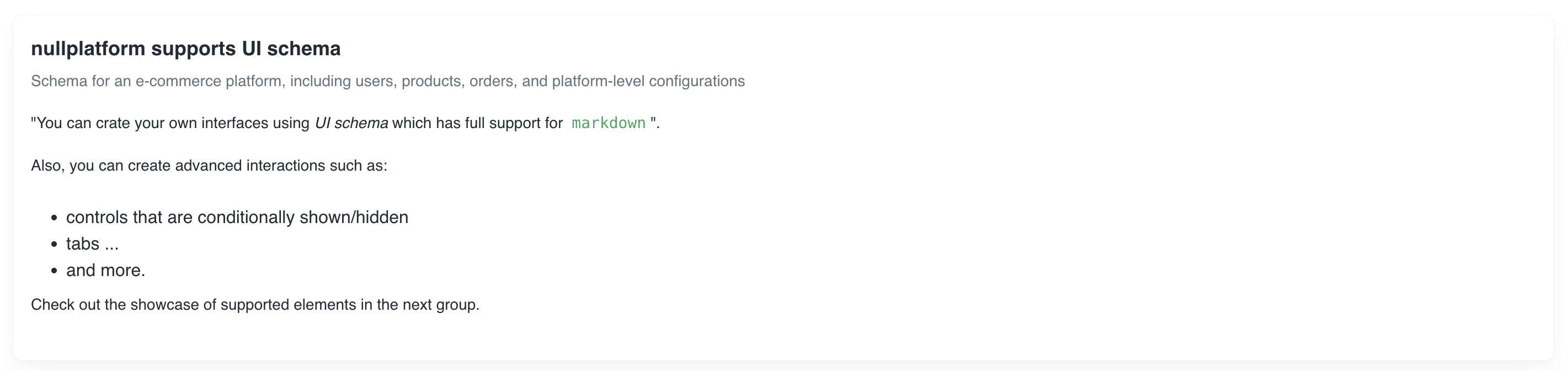
{
"type": "Group",
"label": "UI schema support",
"elements": [
{
"type": "Label",
"text": "Use *UI schema* with full `markdown` support.",
"options": { "format": "markdown" }
}
]
}
]
}
}
}
}
Result: a rendered group with markdown content.
Decorating controls
Combine Label (markdown) with Control elements that bind to your JSON Schema via scope.
Click to expand the JSON example
{
// ...service specification
"attributes": {
"schema": {
"uiSchema": {
"type": "VerticalLayout",
"elements": [
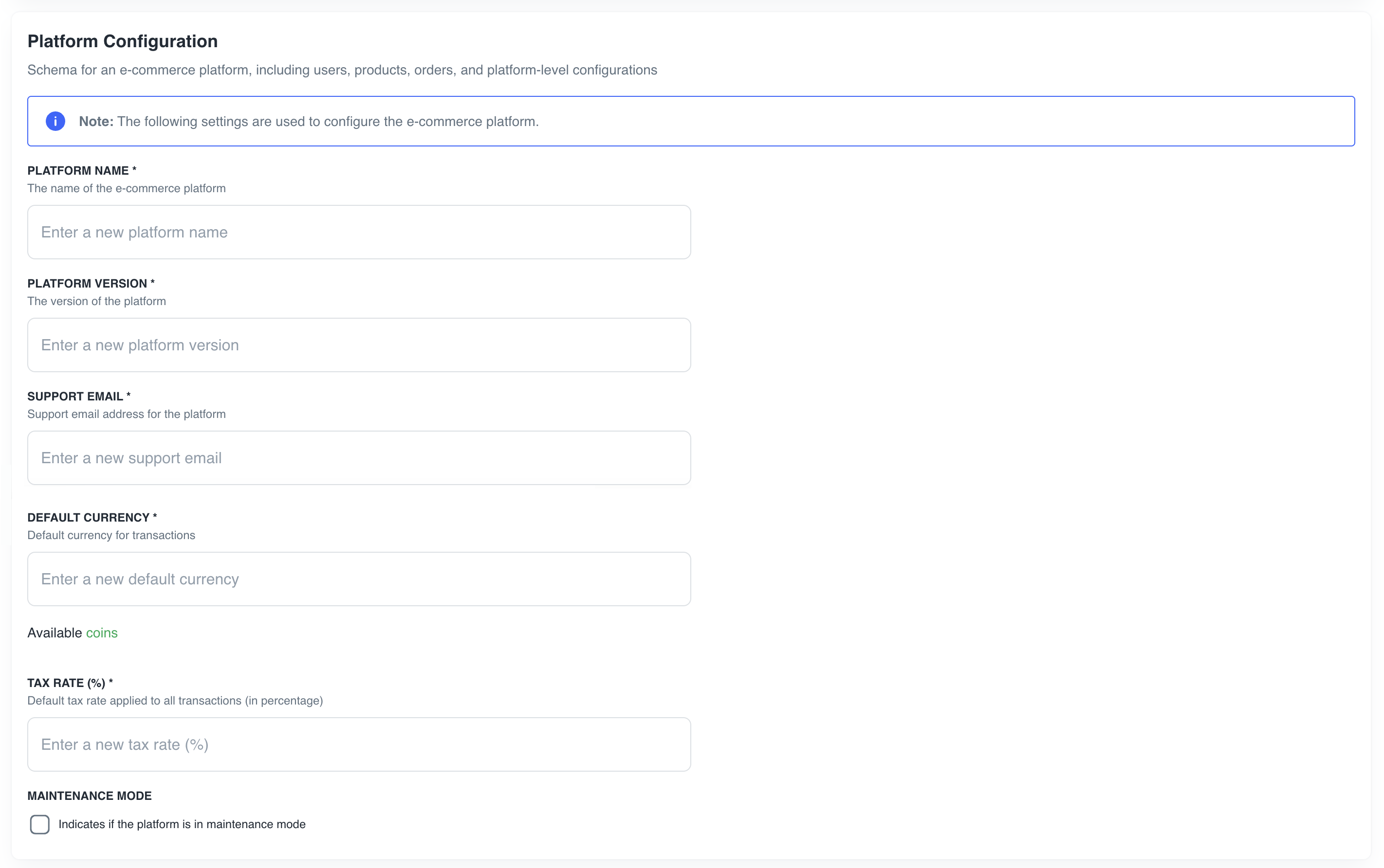
{
"type": "Group",
"label": "Platform Configuration",
"elements": [
{
"type": "Label",
"text": "> [!info]\n> **Note:** The following settings are used to configure the e-commerce platform.",
"options": {
"format": "markdown"
}
},
{
"type": "Control",
"scope": "#/properties/platformName",
"label": "Platform Name"
},
{
"type": "Control",
"scope": "#/properties/platformVersion",
"label": "Platform Version"
},
{
"type": "Control",
"scope": "#/properties/supportEmail",
"label": "Support Email"
},
{
"type": "Control",
"scope": "#/properties/defaultCurrency",
"label": "Default Currency"
},
{
"type": "Label",
"text": "Available [coins](https://www.iban.com/exchange-rates)",
"options": {
"format": "markdown"
}
},
{
"type": "Control",
"scope": "#/properties/taxRate",
"label": "Tax Rate (%)"
},
{
"type": "Control",
"scope": "#/properties/maintenanceMode",
"label": "Maintenance Mode"
}
]
}
]
}
}
}
}
Result: The UI schema will generate a form similar to this:
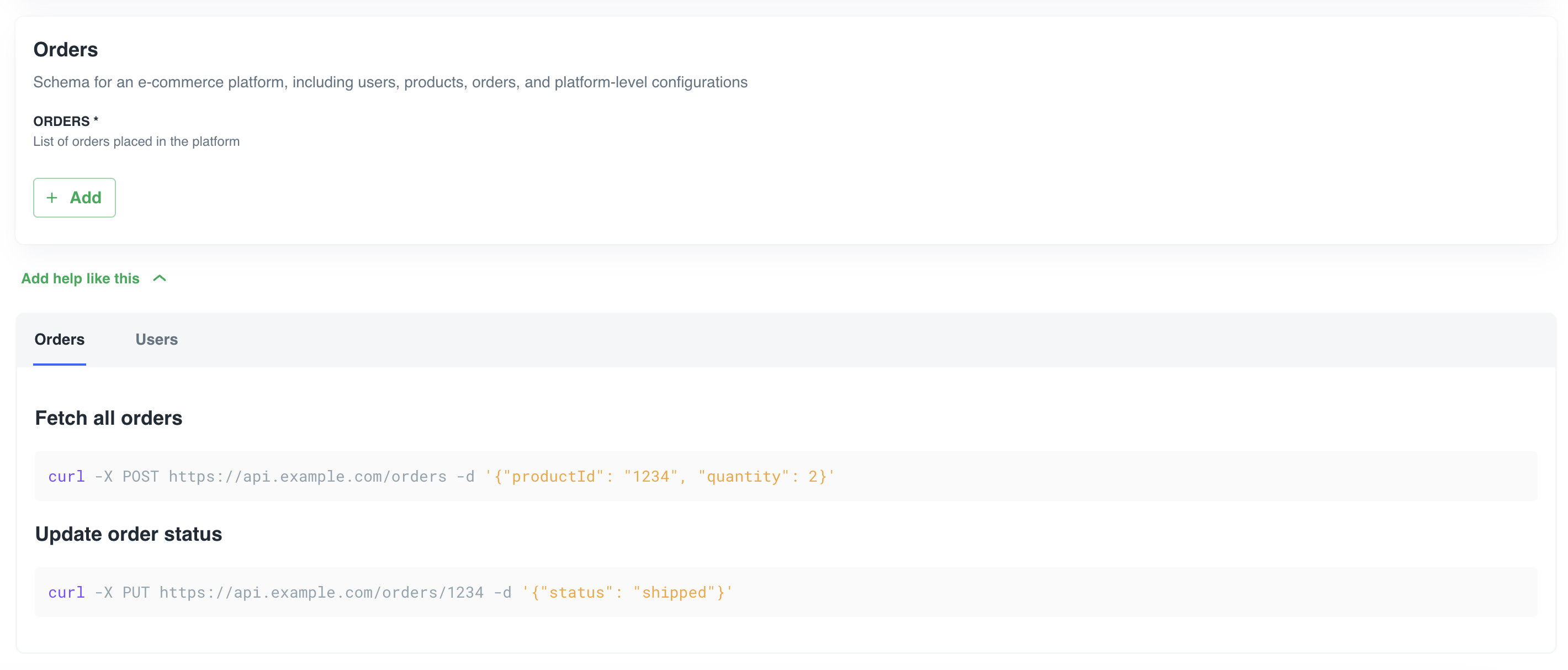
Arrays and collapsible groups
Use nested detail layouts for arrays, and Categorization with Category elements for tabbed/collapsible content.
Click to expand the JSON example
{
  // ...service specification
  "attributes": {
    "schema": {
      "uiSchema": {
        "type": "VerticalLayout",
        "elements": [
          {
            "type": "Group",
            "label": "Orders",
            "elements": [
              {
                "type": "Control",
                "scope": "#/properties/orders",
                "options": {
                  "detail": {
                    "type": "VerticalLayout",
                    "elements": [
                      {
                        "type": "Control",
                        "scope": "#/items/properties/orderId",
                        "label": "Order ID"
                      },
                      {
                        "type": "Control",
                        "scope": "#/items/properties/userId",
                        "label": "User ID"
                      },
                      {
                        "type": "Control",
                        "scope": "#/items/properties/status",
                        "label": "Status"
                      },
                      {
                        "type": "Control",
                        "scope": "#/items/properties/orderItems",
                        "options": {
                          "detail": {
                            "type": "VerticalLayout",
                            "elements": [
                              {
                                "type": "Control",
                                "scope": "#/items/properties/productId",
                                "label": "Product ID"
                              },
                              {
                                "type": "Control",
                                "scope": "#/items/properties/quantity",
                                "label": "Quantity"
                              },
                              {
                                "type": "Control",
                                "scope": "#/items/properties/price",
                                "label": "Price"
                              }
                            ]
                          }
                        }
                      },
                      {
                        "type": "Control",
                        "scope": "#/items/properties/totalPrice",
                        "label": "Total Price"
                      },
                      {
                        "type": "Control",
                        "scope": "#/items/properties/createdAt",
                        "label": "Created At"
                      }
                    ]
                  }
                }
              }
            ]
          },
          {
            "type": "Categorization",
            "elements": [
              {
                "type": "Category",
                "label": "Orders",
                "elements": [
                  {
                    "type": "Label",
                    "text": "### Fetch all orders\n```bash\ncurl -X POST https://api.example.com/orders -d '{\"productId\": \"1234\", \"quantity\": 2}'\n```### Update order status\n```bash\ncurl -X PUT https://api.example.com/orders/1234 -d '{\"status\": \"shipped\"}'\n```",
                    "options": {
                      "format": "markdown"
                    }
                  }
                ]
              },
              {
                "type": "Category",
                "label": "Users",
                "elements": [
                  {
                    "type": "Label",
                    "text": "### Fetch all users\n```bash\ncurl -X GET https://api.example.com/users\n```### Update user details\n```bash\ncurl -X PUT https://api.example.com/users/1234 -d '{\"name\": \"John Doe\"}'\n```",
                    "options": {
                      "format": "markdown"
                    }
                  }
                ]
              }
            ],
            "options": {
              "collapsible": {
                "collapsed": true,
                "label": "Add help like this"
              }
            }
          }
        ]
      }
      // ...traditional JSON schema
    }
  }
}
Use editableOn to tailor the experience by lifecycle stage.
Result:
The UI schema will generate a form similar to this:
For more details, refer to the JSON UI Schema documentation.
Full example
Refer to your existing end‑to‑end example below and adapt the uiSchema placement in services, catalogs, and scopes as needed.
Click to expand the complete JSON example
{
"title": "E-Commerce Platform Schema",
"description": "Schema for an e-commerce platform, including users, products, orders, and platform-level configurations",
"type": "object",
"properties": {
"platformName": {
"type": "string",
"description": "The name of the e-commerce platform",
"minLength": 1
},
"platformVersion": {
"type": "string",
"description": "The version of the platform",
"pattern": "^\\d+\\.\\d+\\.\\d+$"
},
"supportEmail": {
"type": "string",
"description": "Support email address for the platform",
"format": "email"
},
"defaultCurrency": {
"type": "string",
"description": "Default currency for transactions",
"pattern": "^[A-Z]{3}$",
"examples": [
"USD",
"EUR",
"GBP"
]
},
"taxRate": {
"type": "number",
"description": "Default tax rate applied to all transactions (in percentage)",
"minimum": 0,
"maximum": 100
},
"maintenanceMode": {
"type": "boolean",
"description": "Indicates if the platform is in maintenance mode",
"default": false
},
"users": {
"type": "array",
"description": "List of users in the platform",
"items": {
"type": "object",
"properties": {
"userId": {
"type": "string",
"format": "uuid"
},
"name": {
"type": "string",
"minLength": 1
},
"email": {
"type": "string",
"format": "email"
},
"createdAt": {
"type": "string",
"format": "date-time"
},
"isAdmin": {
"type": "boolean",
"default": false
}
},
"required": [
"userId",
"name",
"email",
"createdAt"
]
}
},
"products": {
"type": "array",
"description": "List of products available in the store",
"items": {
"type": "object",
"properties": {
"productId": {
"type": "string"
},
"name": {
"type": "string",
"minLength": 1
},
"description": {
"type": "string"
},
"price": {
"type": "number",
"minimum": 0
},
"stock": {
"type": "integer",
"minimum": 0
},
"category": {
"type": "string",
"enum": [
"electronics",
"clothing",
"home",
"sports",
"books"
]
},
"reviews": {
"type": "array",
"description": "User reviews for the product",
"items": {
"type": "object",
"properties": {
"reviewId": {
"type": "string"
},
"userId": {
"type": "string",
"format": "uuid"
},
"rating": {
"type": "integer",
"minimum": 1,
"maximum": 5
},
"comment": {
"type": "string",
"maxLength": 500
},
"createdAt": {
"type": "string",
"format": "date-time"
}
},
"required": [
"reviewId",
"userId",
"rating",
"createdAt"
]
}
}
},
"required": [
"productId",
"name",
"price",
"stock",
"category"
]
}
},
"orders": {
"type": "array",
"description": "List of orders placed in the platform",
"items": {
"type": "object",
"properties": {
"orderId": {
"type": "string"
},
"userId": {
"type": "string",
"format": "uuid"
},
"status": {
"type": "string",
"enum": [
"pending",
"shipped",
"delivered",
"canceled"
]
},
"orderItems": {
"type": "array",
"items": {
"type": "object",
"properties": {
"productId": {
"type": "string"
},
"quantity": {
"type": "integer",
"minimum": 1
},
"price": {
"type": "number",
"minimum": 0
}
},
"required": [
"productId",
"quantity",
"price"
]
}
},
"totalPrice": {
"type": "number",
"minimum": 0,
"description": "Automatically calculated as the sum of order items"
},
"createdAt": {
"type": "string",
"format": "date-time"
}
},
"required": [
"orderId",
"userId",
"status",
"orderItems",
"totalPrice",
"createdAt"
]
}
}
},
"required": [
"platformName",
"platformVersion",
"supportEmail",
"defaultCurrency",
"taxRate",
"users",
"products",
"orders"
],
"uiSchema": {
"type": "VerticalLayout",
"elements": [
{
"type": "Group",
"label": "nullplatform supports UI schema",
"elements": [
{
"type": "Label",
"text": "\"You can create your own interfaces using *UI schema* which has full support for `markdown`\".\n\n\nAlso, you can create advanced interactions such as:\n* controls that are conditionally shown/hidden\n* tabs\n...\n* and more.\n\nCheck out the showcase of supported elements in the next group.",
"options": {
"format": "markdown"
}
}
]
},
{
"type": "Group",
"label": "Platform Configuration",
"elements": [
{
"type": "Label",
"text": "> [!info]\n> **Note:** The following settings are used to configure the e-commerce platform.",
"options": {
"format": "markdown"
}
},
{
"type": "Control",
"scope": "#/properties/platformName",
"label": "Platform Name"
},
{
"type": "Control",
"scope": "#/properties/platformVersion",
"label": "Platform Version"
},
{
"type": "Control",
"scope": "#/properties/supportEmail",
"label": "Support Email"
},
{
"type": "Control",
"scope": "#/properties/defaultCurrency",
"label": "Default Currency"
},
{
"type": "Label",
"text": "Available [coins](https://www.iban.com/exchange-rates)",
"options": {
"format": "markdown"
}
},
{
"type": "Control",
"scope": "#/properties/taxRate",
"label": "Tax Rate (%)"
},
{
"type": "Control",
"scope": "#/properties/maintenanceMode",
"label": "Maintenance Mode"
}
]
},
{
"type": "Group",
"label": "Users",
"elements": [
{
"type": "Label",
"text": "All users registered in the platform are available [here](https://example.com/users)",
"options": {
"format": "markdown"
}
},
{
"type": "Control",
"scope": "#/properties/users",
"options": {
"detail": {
"type": "VerticalLayout",
"elements": [
{
"type": "Control",
"scope": "#/items/properties/userId",
"label": "User ID"
},
{
"type": "Control",
"scope": "#/items/properties/name",
"label": "Name"
},
{
"type": "Control",
"scope": "#/items/properties/email",
"label": "Email"
},
{
"type": "Control",
"scope": "#/items/properties/createdAt",
"label": "Created At"
},
{
"type": "Control",
"scope": "#/items/properties/isAdmin",
"label": "Admin"
}
]
}
}
}
]
},
{
"type": "Group",
"label": "Products",
"elements": [
{
"type": "Control",
"scope": "#/properties/products",
"options": {
"detail": {
"type": "VerticalLayout",
"elements": [
{
"type": "Control",
"scope": "#/items/properties/productId",
"label": "Product ID"
},
{
"type": "Control",
"scope": "#/items/properties/name",
"label": "Name"
},
{
"type": "Control",
"scope": "#/items/properties/description",
"label": "Description"
},
{
"type": "Control",
"scope": "#/items/properties/price",
"label": "Price"
},
{
"type": "Control",
"scope": "#/items/properties/stock",
"label": "Stock"
},
{
"type": "Control",
"scope": "#/items/properties/category",
"label": "Category"
},
{
"type": "Control",
"scope": "#/items/properties/reviews",
"options": {
"detail": {
"type": "VerticalLayout",
"elements": [
{
"type": "Control",
"scope": "#/items/properties/reviewId",
"label": "Review ID"
},
{
"type": "Control",
"scope": "#/items/properties/userId",
"label": "User ID"
},
{
"type": "Control",
"scope": "#/items/properties/rating",
"label": "Rating"
},
{
"type": "Control",
"scope": "#/items/properties/comment",
"label": "Comment"
},
{
"type": "Control",
"scope": "#/items/properties/createdAt",
"label": "Created At"
}
]
}
}
}
]
}
}
}
]
},
{
"type": "Group",
"label": "Orders",
"elements": [
{
"type": "Control",
"scope": "#/properties/orders",
"options": {
"detail": {
"type": "VerticalLayout",
"elements": [
{
"type": "Control",
"scope": "#/items/properties/orderId",
"label": "Order ID"
},
{
"type": "Control",
"scope": "#/items/properties/userId",
"label": "User ID"
},
{
"type": "Control",
"scope": "#/items/properties/status",
"label": "Status"
},
{
"type": "Control",
"scope": "#/items/properties/orderItems",
"options": {
"detail": {
"type": "VerticalLayout",
"elements": [
{
"type": "Control",
"scope": "#/items/properties/productId",
"label": "Product ID"
},
{
"type": "Control",
"scope": "#/items/properties/quantity",
"label": "Quantity"
},
{
"type": "Control",
"scope": "#/items/properties/price",
"label": "Price"
}
]
}
}
},
{
"type": "Control",
"scope": "#/items/properties/totalPrice",
"label": "Total Price"
},
{
"type": "Control",
"scope": "#/items/properties/createdAt",
"label": "Created At"
}
]
}
}
}
]
},
{
"type": "Categorization",
"elements": [
{
"type": "Category",
"label": "Orders",
"elements": [
{
"type": "Label",
"text": "### Fetch all orders\n```bash\ncurl -X POST https://api.example.com/orders -d '{\"productId\": \"1234\", \"quantity\": 2}'\n```### Update order status\n```bash\ncurl -X PUT https://api.example.com/orders/1234 -d '{\"status\": \"shipped\"}'\n```",
"options": {
"format": "markdown"
}
}
]
},
{
"type": "Category",
"label": "Users",
"elements": [
{
"type": "Label",
"text": "### Fetch all users\n```bash\ncurl -X GET https://api.example.com/users\n```### Update user details\n```bash\ncurl -X PUT https://api.example.com/users/1234 -d '{\"name\": \"John Doe\"}'\n```",
"options": {
"format": "markdown"
}
}
]
}
],
"options": {
"collapsible": {
"collapsed": true,
"label": "Add help like this"
}
}
}
]
}
}
What's next?
Now that you’ve tried it out and got a handle on how the preview works, check the reference pages for special JSON Schema keys and UI attributes to customize your own forms.